Tuesday, October 30, 2012

Grey Interplay


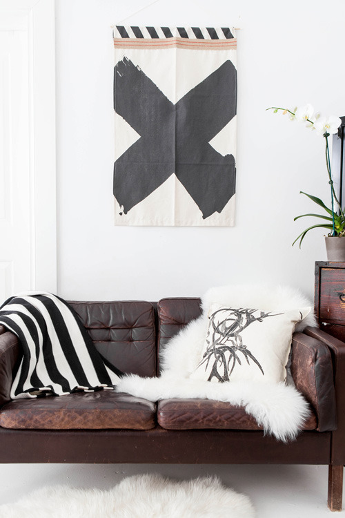
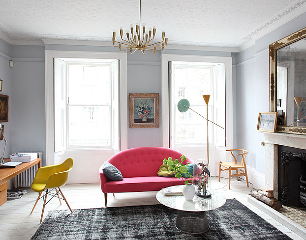
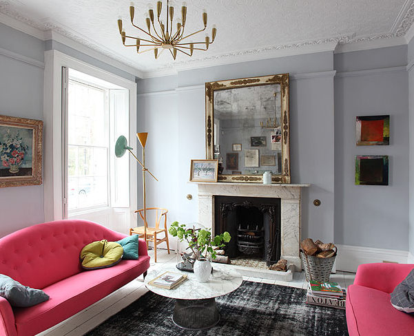
Today, a swift change towards grey. It is indeed dramatic, certainly not for the faint of the heart. In our humble opinion it's worth it. You'll get this strong, flavorful, and dense environment full of attitude, and still, it's neutral enough, with a generous margin for free expression: pink, orange, blue, red, green, gold, silver... By the way, you can even play with different slabs of grey, interplaying with the chromatic temperature, with the warmth and the coolness of it. Get more of this scenario, after the jump!

Monday, October 29, 2012

Femininity Fête


Another australian home, this one is owned by Annabelle Kerslake, ex-florist, half Fête Press. You quickly get clear femininity from all details. The clean background, floral everywhere, the furry carpets, the fluorescents pinks/blues, together with dark, earthy tones that make those sweet contrasts along the way. And an overall organic and gossamer feeling, make this a classy and classic decor. Just maybe, we would love to see more of the brown tones.

Get it all after the jump, and then, have a look at their publications at Fête. Ready yourself to drool!

Thursday, October 25, 2012

Open Bar Colour Party in Brazil


Brazilian homes, we love them! Bright happy colours and the best sunshine! This one, in particular, has one of the most spectacular and functional kitchens we've seen in awhile. It's practically a bar, we love it! And together with the openness of the social space, it's perfect for dance parties. More colours after the jump!

Wednesday, October 24, 2012

Mint & White


A perfect colour combination on these pics. Pay attention to this Weekday Carnival blog. Besides the fact that it's pratically stuffed with only-perfect items, it is managed by some kind of DIY master and respective family... Interesting...

Tuesday, October 23, 2012

MEOW!!!


MEOW!!! More black, white, grey and patterns... In a kitchen! Check it out!

Monday, October 22, 2012

Yet Again — Pink


Super-happy to have found this. Another soft pink sofa surrounded by goodness. And here, it's contextualized in a more masculine set, which absolutely gives an important super-warm and sensitive look to a commercial space.


The owner: photographer Jeremy Harwell. It's a narrow studio, but has a lot more of magnificent details to look at, specially wall art — after the jump!

Thursday, October 18, 2012

Georgian Via Somerset Via Ilse Studio


Ilse Crawford is kind of a godess to us, and it shows up here as a no-surprise post. She masters at almost every aspect of the interior design spectrum.


This house has great natural charms, and is gifted with generous spaces and hasting sun light. Probably, an easy decision to bet on the dark walls, because it's the obvious path if you need to concentrate some coziness, in spacious rooms. As always, Ilse's colour combinations are flawless and every piece the right one. Don't miss all this goodness them after the jump!

Wednesday, October 17, 2012

L'amour (Fusion) à Paris


This marriage is amazing. Apart from the undoubtedly/possibly cute/devilish 7 year old daughter, it's a fusion between contemporary art, him, and antique collectionism, her. As you can see, it went a great deal more than plain simple horrid. Just beautifully inspiring!


Allow this reminder about lighting, use colour to light up your house. You might as well get coloured lamps, but you won't even get near the greatness. With light and paint, contamination is reciprocal and you'll notice a more enriched outcome: the surfacing becomes gradiented, and the reflections will gracefully hit the adjacent rooms. Results may vary, but thats the beauty of it — get used to this!

Get that last picture, after the jump. THE best way to integrate art in your decor.

Tuesday, October 16, 2012

Georgian House in London


Again, with a pink sofa! The base colours are wonderful and yummy. Very light and fresh! And all is left to do, for that spicy wow factor, is to bet on the vivid and fluorescent colours. It's done deal!


If you're drooling already, you can rent it at Light Locations. Maybe you can fill it in with your style and photo-shoot it. Get more of this gem after the jump!

Monday, October 15, 2012

NY With a French Twist

That essencial soft pink!

Today it's NY! Let's go to Brooklyn, take a look at this dreamy apartment with a delicious french touch. Every detail is great in a way that it delivers something elegant but also a strong, bold confidence, with a good sense of opportunity, and it's a nice collection of good decor pieces.


We absolutely love the black room (after the jump). The nice contrasts with the white tables, decorative mirrors, jars... And everything in its rightful place.

Wednesday, October 10, 2012

Light Vs Black Paint


Do you have a big window? OK, you can paint your house with black! Just everything!

One big, narrow and yellow abat-jour will surely guarantee a happy customer in any scenario.

This is the eclectic, eccentric, semi-clumsy and hippy style of Abigail, in her own house. A dramatic turn from our usual white swedish into black british. Learn how every detail communicates with the dark background. How colour must turn vivid in order to work properly. Check her classy bathroom after the jump!

Tuesday, October 9, 2012

Hat tip to Madrid


Check out this paraphernalia of textures! This is what we love the most about latin interiors: the extroverted style in the usage of colour and pattern. Makes it all so welcoming and much more happy.


This is the house of a madrileño hat designer, you can see a couple of hats around. It's zero-shame when combining two similar patterns, with the same exact colours (see those zebra patterns). There's a powerful sense of placement and fluctuation between the mediums and all is decor, the books, the cut-outs, frames Vs sticked-papers-on-the-wall, eclectic furniture, savage plants, dead birds... One rule: make it count!

Monday, October 8, 2012

Get to work!


We've seen this around, not sure where... But this is inspiring, and that brass lighting pipe kills it. We just needed it in this blog!


That is one rad wallpaper. One of the best solutions to break the white vastness and to add a bit of an eclectic feel to the room.

Ready Yourself for Indoors


It's finally raining here in Portugal. Sad... Avoid weather adversities and hit the indoor pitches. Pick a nice restaurant, visit some friends, and in extreme situations go for a semi-wet walk in the park, with the fanciest umbrella.


Here, a good combination for the daily life. Gather the warmer textures, like woods and fabrics, avoid using too much plastic. Control the hues to neutral tones. Life will give you the best: a green coat on a chair, your pink wallet, magazines and colouring books, those vivacious flowers from the market, red boots, bra spread across the floor...

Monday, October 1, 2012

Playtime with the Gartmyrs


This dwelling is another good example of how far you can reach with colour and pattern combinations, having a good base layer to play with. Of course, you can further push this combinational notion by picking other base colours, if you find the white colour a bit too clinical.

See more examples in this post to get the plenitude of this concept.


In the Gartmyr house, you get the full gamut of colour, and a vast catalogue of patterns. All nicely packed up and carefully framed in every division. You'll also notice how kid-friendly and dreamy it is, like a blank sheet of paper, ready to be scratched (hide the crayons, honey!). It is really inspiring to see how the details appear along the house, so get them all after the jump.